Forever 21 - A Post Mortem Analysis
We've analysed their UX, here's what we found
Another one bites the dust. Or at least in the case of Forever 21, it seems to be on the very near horizon. Earlier this week, the California based high street fashion giant filed for bankruptcy protection. The business, who employ almost 33,000 people globally has announced that it will close its doors on 350 of its stores. This includes the cessation of trading in entire countries - 40 of them - including Canada and Japan. In fact, in its homeland of the USA, Forever 21 will close 178 of these stores.
Here in the UK, we have seen Forever 21 stores closing over recent years and struggling in general with falling foot traffic. Although business representatives have cited internal restructuring as one of the key contributors to the demise, it has been clear for a long while that the brand has struggled to compete with the likes of Zara and H&M.
We are also seeing a shift in how young consumers are buying, and aligning to brands. With the school strike for climate change now reaching millions of people every week, the young consumer market are becoming more and more aware of the impact of fast fashion on the world around them. What will this mean to other brands that are operating at this end of the market? Primark draws a similar comparison in its bricks-and-mortar approach, with very little investment on it's online sales strategy. It is also heavily based on cheap, fast fashion items of low quality, much the same as Forever 21. Could this be another fashion retailer that struggles with the changing economy?
Talking numbers, Forever 21 has been haemorrhaging money for a long time. In fact, in this past year, it was down $1.1 billion compared to previous years. Were shifts in consumer tastes solely to blame here, or were there other issues at play?
We wanted to find out more. We did an audit of the website of Forever 21, and here is what we found.
1. Confusing Propositions
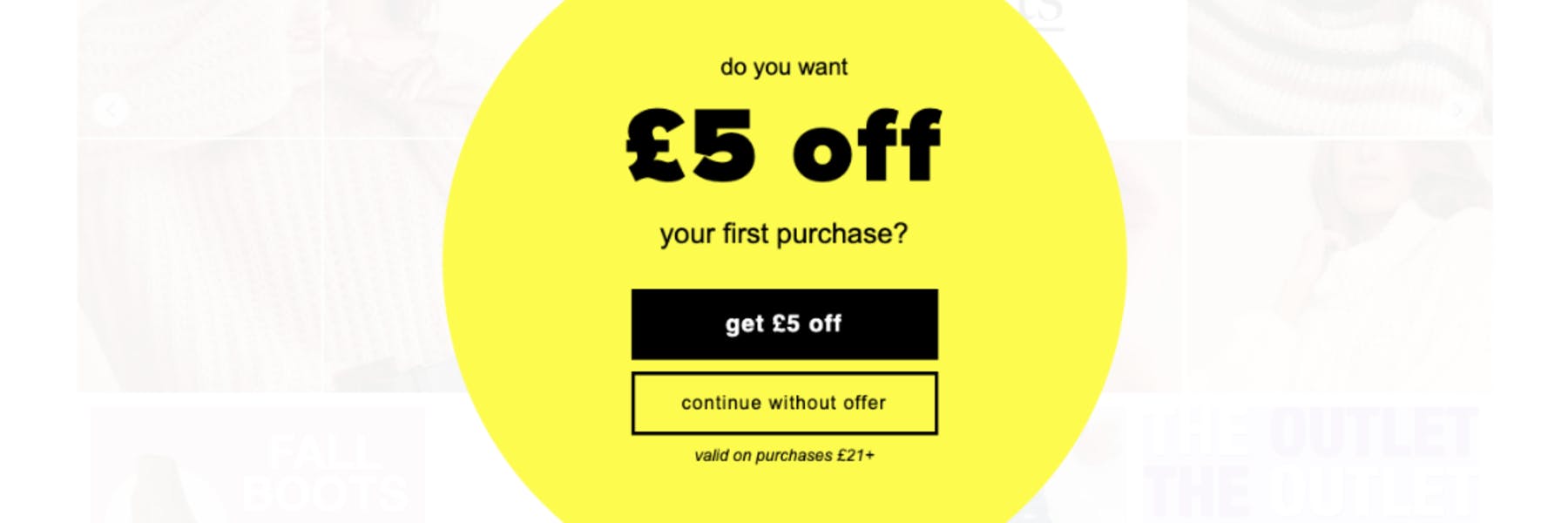
As soon as you enter their website, you’re presented with a full screen takeover asking if you want £5 off, or to continue on as normal, without the discount. This is their way of asking you to sign-up for an account before you’ve even had the opportunity to look at their products. Not only is this poor timing, but it’s not what a user expects to see as soon as they land on a site. There’s absolutely no harm in advertising their discount incentive on the site, but forcing users to make an immediate decision without any context around product or pricing, is premature. This would have been much more effectively positioned at the start of, or during, the checkout flow. This is when you have a more committed customer, rather than a window shopper.
2. No Point of Focus
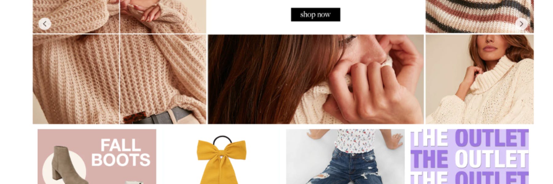
Once you get beyond the sign-up option (if you choose to), you come across a very busy homepage that contains carousels, flashing images, rotating gifs and an array of bright colours shouting for attention. You’d be excused for missing the fact there are actually ‘call to action’ buttons (or CTAs) in each of these areas. There is simply too much going on, and too many distractions for a modern day consumer. Not only is this layout disorientating, but it is also potentially damaging for those users who have come to the site to just browse the catalogue.
The same problems apply to mobile devices. This is potentially more so, as on mobile you’re consolidating all of this noise into an even smaller visual space. There appears to be very little consideration on the Forever 21 site as to the use of colour, such that it lacks flow and a sense of direction.
It’s not all bad however. The ‘Search’ bar is clear to see, although the use of this is likely increased due to the confusion on the page. This works for those who are looking for something in particular, not that great for those who just want to browse.

3. Product Detail Page (PDP) Hierarchy

Next we looked at the PDP - the page that needs to work the best to get users into the checkout process when shopping online. This is a vital step for any online retailer to get spot on. When you first land on the Forever 21 desktop site, the page content is very divided. There are descriptions on the left hand side, thumbnails images of the item directly above, a main ‘hero’ image of the item in the middle, and the remaining content on the right hand side. Much like the homepage, it’s hard to know where the point of focus on the page is. The CTA suddenly has a gradient on it, which is inconsistent with the rest of the site, and the use of black clashes with other solid areas of black surrounding it. This devalues its prominence on the page and doesn’t draw the users attention.
Looking to the right hand side of the page, we can also see functions that aren’t available for use - in this instance - a video that isn’t viewable. It’s vitally important to only show useful user interface (or UI) elements to drive the user to a sale. Displaying unnecessary functionality, or something that isn’t available, is only distracting users from potentially converting.
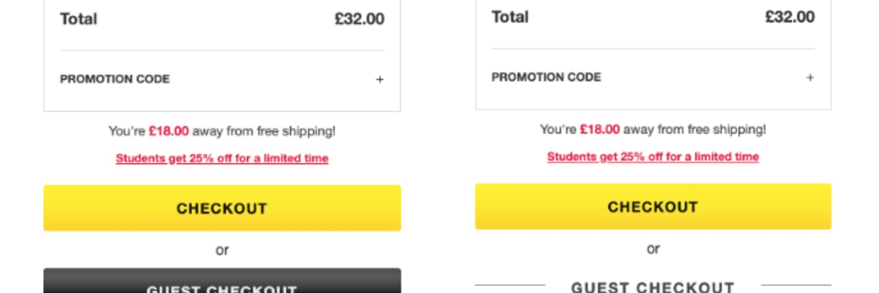
Another area of concern on this page is the “25% Off” message - located directly under the CTA. This link actually directs you away from the page, to a completely different area of the site, where it asks you to “log in” or “register”. Again, this is poorly positioned and takes users out of the buying journey. It takes the user onto a completely different journey to then register, which would have been much better positioned within the initial checkout flow. This is in addition to additional weblinks in “The Promise” messaging at the top. This also takes users back in to the PLP they’ve just visited from, or to a signup/register page. This can be very frustrating for users. In fact, it’s almost the conversational equivalent of someone changing the subject any time you started talking.
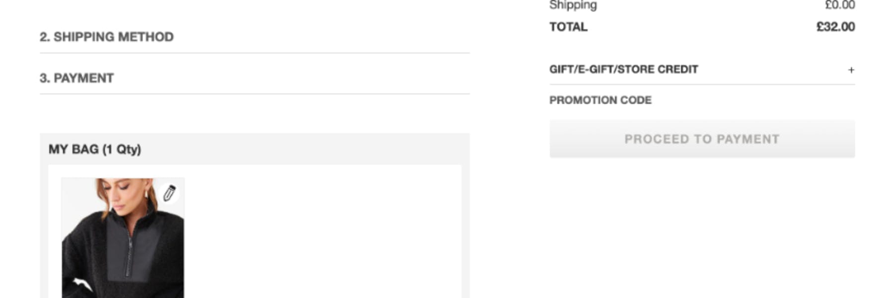
The site appears to be so intent on gathering user data, it’s overriding the number one objective of an eCommerce sales site. Which is, to sell their products.
4. Wrong Time, Wrong Place
So assuming the user has persevered and reached their checkout basket, and ready to buy. But, the first thing they encounter upon selecting “Guest Checkout” is to be confronted with a request for their email address again. This is following the barrage of data collection hurdles that have already been jumped over. We understand why (from a data collection and market research perspective) they are so intent on doing this. They want trigger abandoned basket campaigns, and follow up with their abandoned sales. But the result of their premature and continued harassment for a users email address has a data farming feel to it, which is off putting for many. Ultimately, with softer messaging further along the checkout process, the email address will be willfully given by the user anyway. But the way in which it is constantly presented on the Forever 21 site makes it feel less about the purchase and more about the mailing list.
When a user gets to their shopping basket on a mobile device, there isn’t even a visible CTA. It is pushed so far down screen by the upsell messaging. If their primary focus was on converting that user, who is already committed and taken an interest in a product, they would have far greater sales success. Following this up with upsell messaging, as opposed to preempting it too early on in the piece and risking the initial sale, is a best practice tactic that they should have observed.
5. Zero UI Design
So against all odds, the user has made it to the checkout page and they really want to buy. They get through to the next page of the checkout proceedings and they have just one single link that says ‘Add New Address’. Clicking on this link strangely opens a side panel, allowing the user to input their address information.
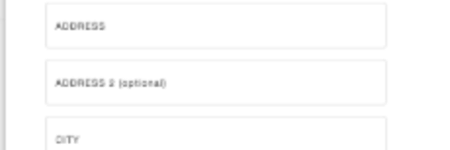
Why?!!! As a business you already know you need this information for delivery. But why isn’t this in-page put on show by default? This is an additional forced interaction that provides an unexpected action. When it comes to any transactional website - especially in the checkout section of a website - it is critical to keep it simple. Keep it clean. Keep it logical. On the Forever 21 checkout page, this same interaction happens again at the “Payment Type” stage, which again, is very confusing. This same interaction also takes place on their mobile site checkout, but it slides in as a full screen overlay. This is ‘better’ than the desktop version, but the question begs, why were these crucial pages not shown in-page by default in the first place?
6. Is This Genuine?

When you get to the payment screen on the Forever 21 website, you then get redirected to a completely unbranded page. This raises a lot of suspicion. Is this a real page? Has the site been hacked and directed users to a scam page? Is this safe? Planting this doubt in someone’s mind in the checkout stage of the proceedings is the absolute worst thing a business can do to negatively impact their conversion rates. Not having a visible logo is like asking someone to give their card details to the guy on the street corner. Consumers are very clued up to online fraud and security these days. This section of their online shopping experience is like the nail in their coffin - they cannot expect young savy users to trust in these kind of poor experiences when other competitors are doing a far superior job.
So What Can We Learn From This?
In the case of Forever 21’s digital presence, it’s clear that the business didn’t really understand their customer base. This was reflected on multiple areas of the site, and key areas at that. It feels as though there were people making decisions on the design on the website, that perhaps weren’t best positioned to make those decisions. We see this sometimes in big businesses where there are too many stakeholders with their own aesthetic opinions, all trying to get their own ideas onto the site without the ideas being validated. This could also be down to siloed teams doing their own small parts of the puzzle without coming together to look at the end function.
We don’t really know what went on behind closed doors. What we do know, is that there are areas of the Forever 21 website that have either been over-engineered, or designed in such a way that the usability of the site wasn’t considered. These things are vitally important, and noticed by users. We are in an age where we are seeing dramatic drops in foot traffic retail in favour of online shopping. Consistently among those failing, we are seeing patterns of failure in their attempts to adapt to a shifting method of selling. There is an art and a science behind constructing gracefully flowing user journeys online. Patch-working websites together for sales simply doesn’t cut it for these big retailers - and ignoring the signs and advice will continue to be at their own peril.
Written by Shelley Grierson
Analysis by Alan Clark